Dorian Gray
Enjoy the moment
BRIEF:
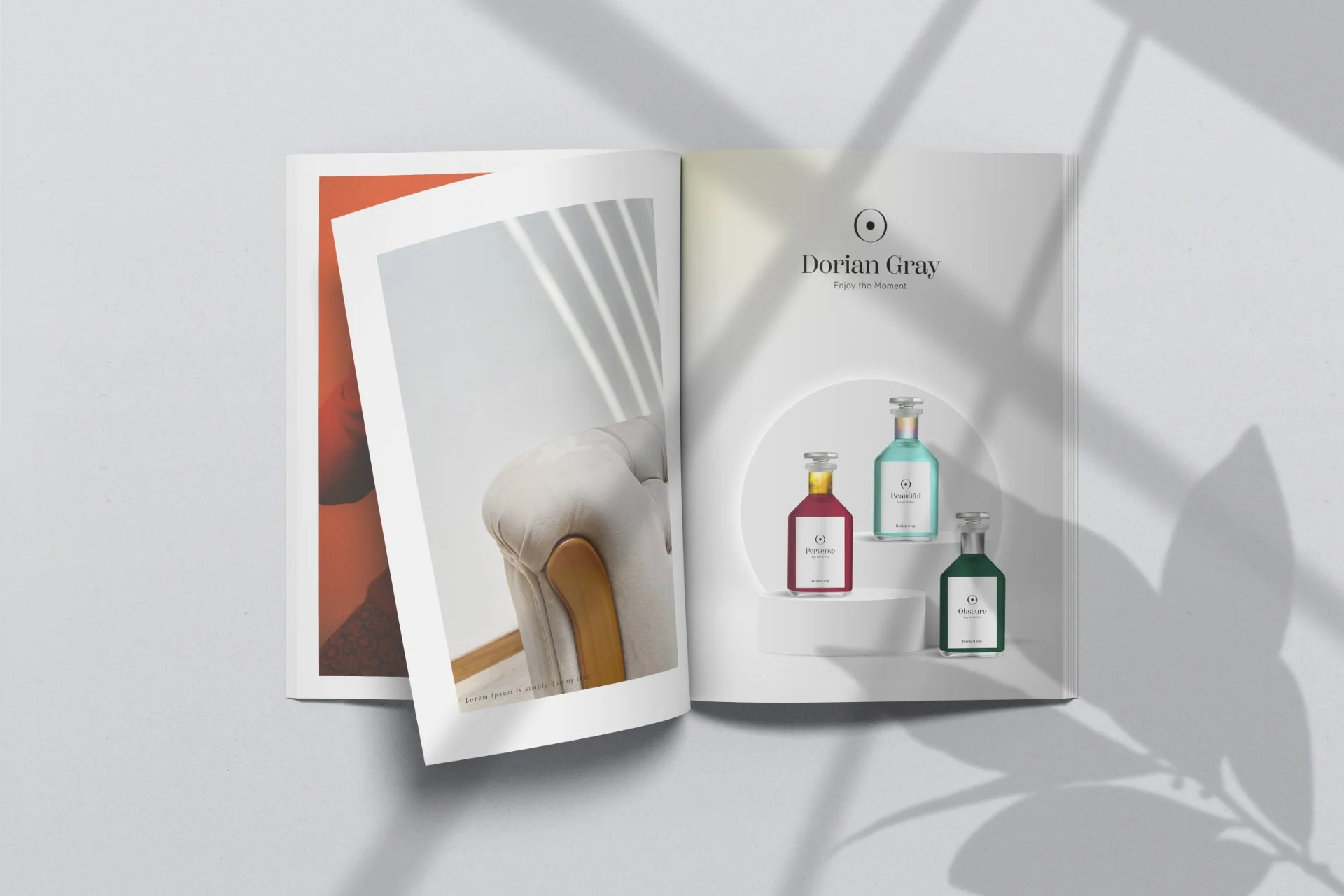
Develop the visual identity and packaging for a line of 3 niche perfumes (Beautiful, Perverse, Obscure) based on a theme found in the classic novel The Picture of Dorian Gray.
CONCEPT:
Use the symbology of the moving sun and different metals to talk about the inexorable passage of time.
CHALLENGES:
Designing for the luxury and artistic market while retaining personality and colors.
The erosion of time
Beautiful, Perverse, Osbcure: each name represents a phase of Dorian Gray’s story, and each one documents his descent into depravity. Through the colors and materials chosen for each packaging I wanted to convey this journey, starting with the dream-like and innocent qualities of pastels and iridescence; passing through the passionate reds and the everlasting and oppulent yet delicate golds; and landing in the eery stillness and corrosion of swamp greens and oxidized silver.


