Kuburoma K Cup 24
Re-inventing 10 years of passion
BRIEF:
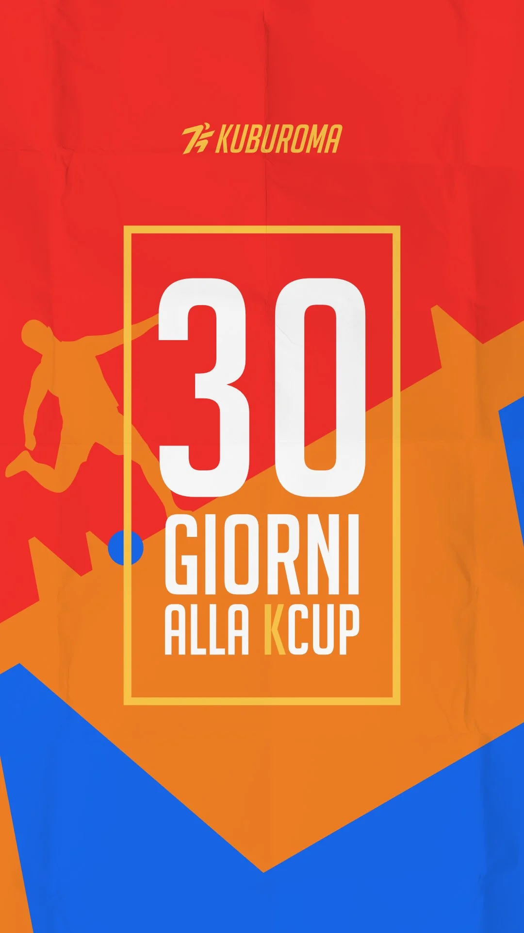
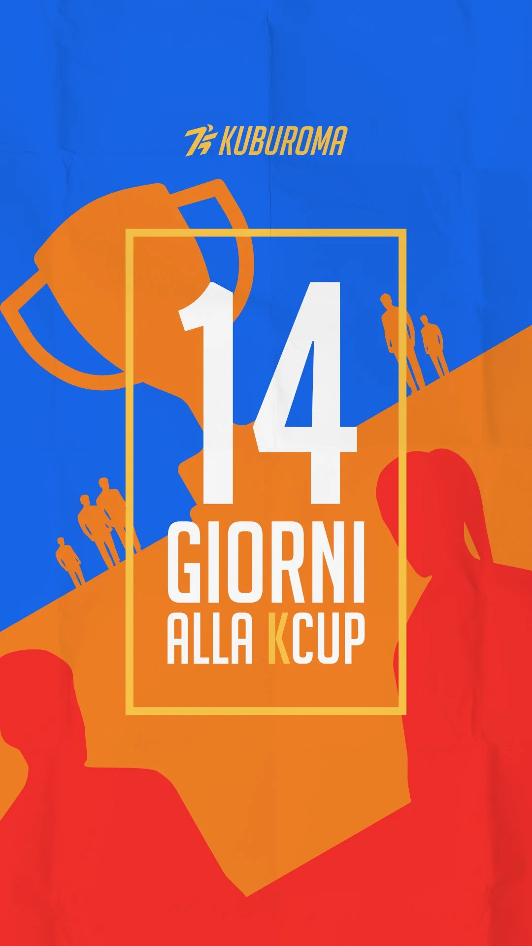
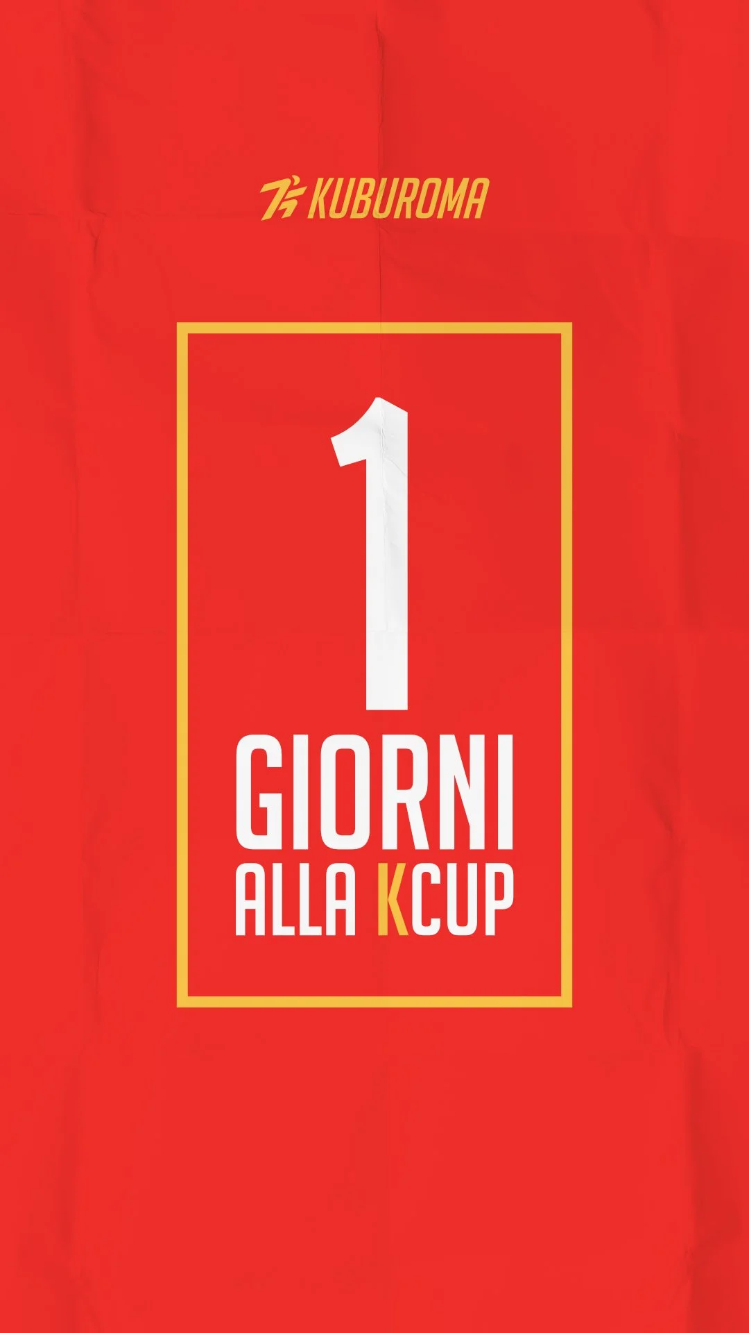
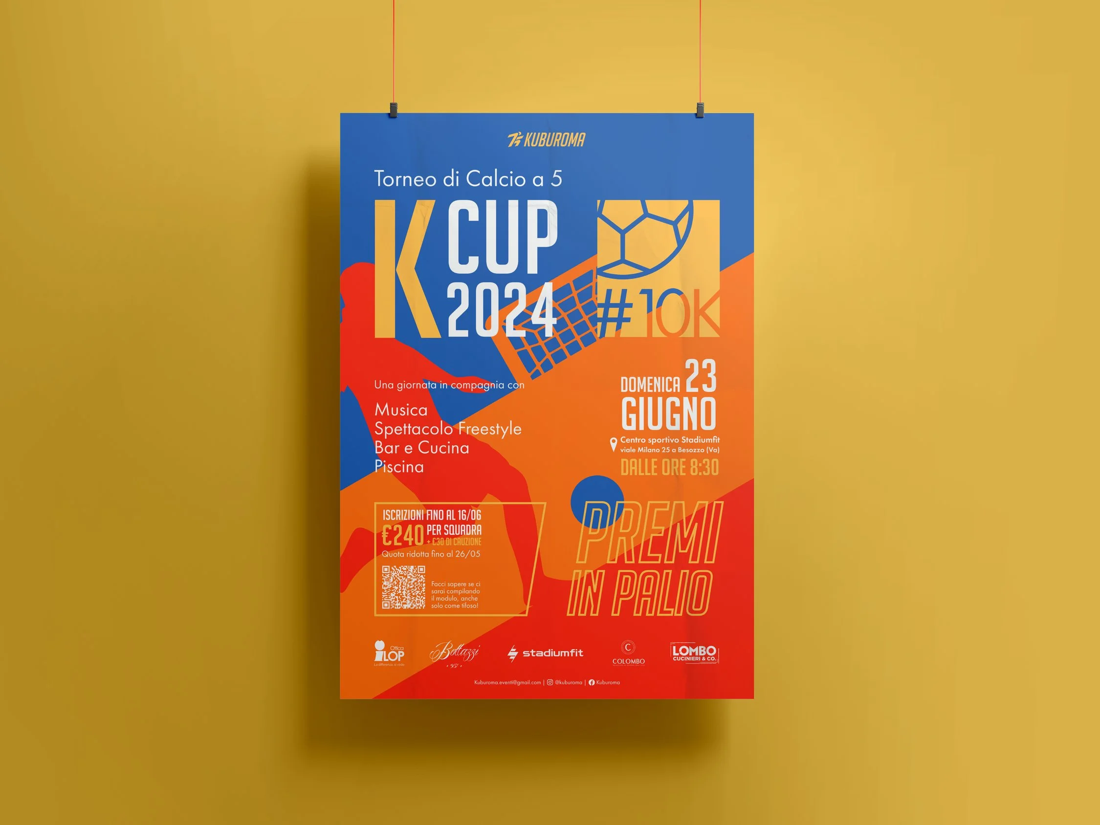
Restyle the brand’s logo and create visuals for the social media campaigns of the K Cup’s 10th edition.
CONCEPT:
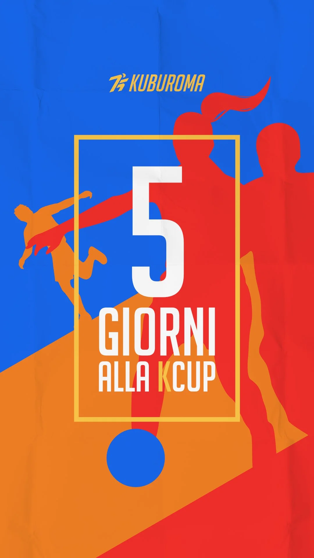
Push forward the idea that the brand is made up of 3 passionate but distinct indivisuals, employing foreground, middleground and background compositions as a graphic metaphor.
CHALLENGES:
Modernizing the brand, providing it with a more robust framework for future graphic endevours, while respecting its last 10 years and working within the confines of small clients.
A flexible suite
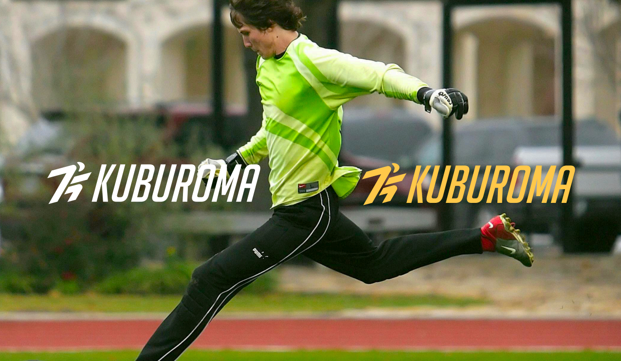
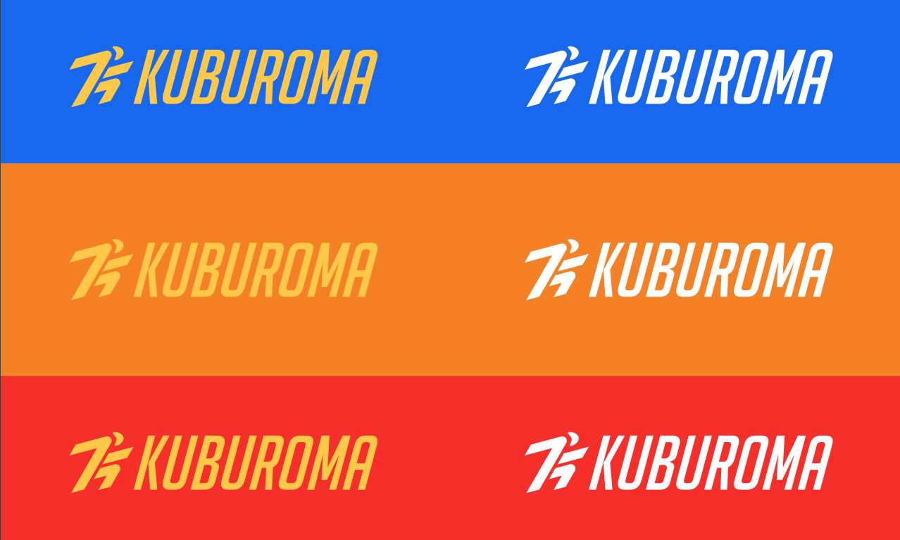
Though not originally asked, the clients were provided with a suite of restyled logo variations and a guidebook, so that they would be best equipped to use their brand in the future. The logos themselves took inspiration from sports giants such as Decathlon for a strong yet playfull and energetic look, as Kuburoma wanted to expand beyond footbal in the near future.
3 hearts beating in sync
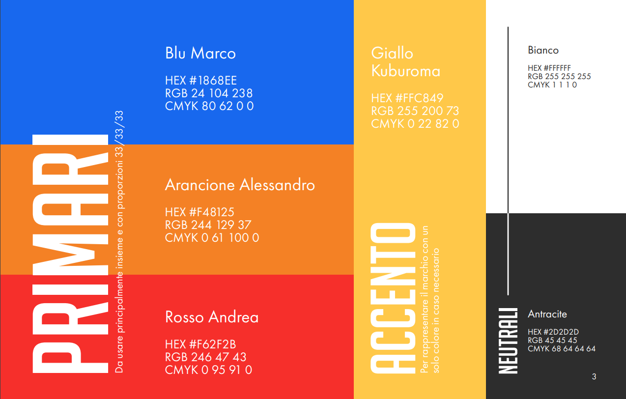
Kuburoma was founded by 3 friends with a common dream: to see people have fun together playing football. Each of these visionaries was represented by their favourite color in the old brand image, and I was asked to find a way to keep this sentimental aspect. Through careful consideration of values, hues and contrast I was able to find a balanced trifecta which could be supported by the accent color and the brand’s neutrals.
